A Winning Dining Room Makeover
Remember that contest I ran way back in October for a FREE room makeover? I’m thrilled to finally show you the results! The winner, Jen, was an old college friend I hadn’t talked to in years, and when the algorithm I used randomly picked her, I was pumped that it gave us the chance to reconnect. She’d already determined that she needed the most help with her dining room (see below), which is located in the front of her Washington, D.C home built in 1955. Total budget: ~$2-3K.
PROPOSED DINING ROOM
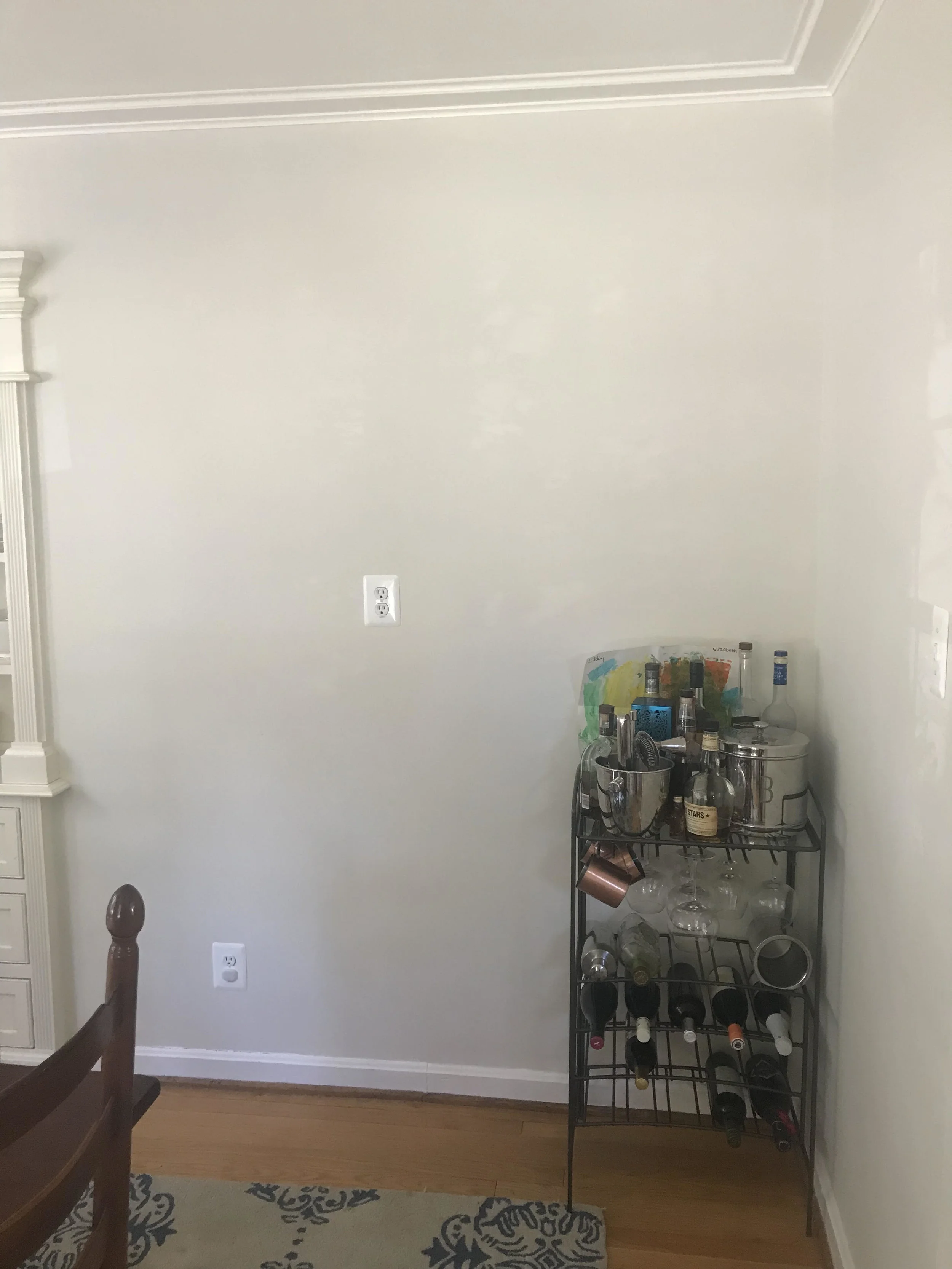
CURRENT DINING ROOM
Here were some of Jen’s main issues with the space:
1) Storage: The home has no real entryway, which means this room had become a haphazard dumping zone for scooters (she and her husband have two young daughters), shoes, mail etc. Jen and her family were desperate for a place to organize mail, coats, shoes, and the like.
2) Walls: Jen loved the idea of some color on the walls or even some wallpaper, but she felt overwhelmed with options and didn’t know where to start.
2) Chairs: While the current dining table is a beautiful family heirloom that the family loves, the dining chairs were so worn they were falling apart. Replacing them was a top priority.
3) Rug: The rug is another old item they hadn’t gotten around to replacing. It’s worn and the pattern is dated. In its place we needed something that incorporated color and could withstand busy life with kids/spills.
4) Art: All of the photos in this room were taken during family trips, so they’re certainly meaningful and worth keeping. But as Jen said, “the frames are pretty abysmal.” What I immediately noticed is how the frames didn’t match and were scattered throughout the room without any real intention or common aesthetic.
5) Bar: Their old wire bar cart barely kept liquor bottles in the air. And for a couple who loves cocktails, it was most definitely time for an adult home bar they can show off to their friends.
Here were two other main issues I had:
6) Light fixture: Bad light fixtures stick out like sore style thumbs. The great news is that you can find really beautiful, inexpensive fixtures via so many sources these days. I couldn’t wait to offer a new option.
7) Curtain rods: It’s amazing how impactful it can be to swap out old, bulky curtain rods with chic, modern ones. It’s like changing something up in your beauty routine that elicits compliments, even thought people can’t quite put their finger on why you look so fresh. Little change, big impact.
VERSION 1
In my first version of the room, I went for an overall look that incorporated their favorite colors with a fresh, modern feel. I found a cool wallpaper with a midcentury modern pattern, as well as ivory and brass chairs that countered the dark paper and didn’t cost a fortune. But when Jen took a look at the design, she felt overwhelmed by the wallpaper (“I wish we were more adventurous, but it’s just a bit too bold for us.”). This is a totally valid opinion. She also felt like the chairs and light fixture might be a bit too modern for their style. And this is often the case when it comes to design. We can’t define or explain what we like until we see some options. So it was back to the drawing board for me.
VERSION 2 (a and b)
I settled on two new options: 1) another blue pattern by Chasing Paper x West Elm featuring a smaller, more subtle pattern (although it’s impossible to mock-up without creating those grid-link shadows…so just try to look past them) 2) an ivory and dusty champagne/pink patterned paper that was even more subtle. The light fixture I found is much more traditional in shape but with thin, minimalist lines, and it worked with either wallpaper. As did the rug, which has since sold out but here’s a similar one. Jen found these faux ivory leather dining chairs that are more traditionally shaped, while I offered up some blue upholstered chairs that work best with the ivory wallpaper.
In the bar corner of the room, I brought in a cabinet that offers plenty of storage and much more top surface space for grouping the most frequently used bottles on a tray (everything else can get stored underneath). Above the bar I created a gallery wall as an intentional place to group family photos in similar frames. This move creates a more cohesive display than what they previously had going on. And finally a modern coat rack tucked into this corner offers a designated place to hang coats, hats, and bags.
In the other corner of the room, I designed a nook that will optimize storage. I love this clever hanging basket situation because you can totally customize it to your needs. And I love the simple lines and neutral color of this storage bench, as well as its drawers and bottom shoe rack. To make sure every base was covered, I added a lidded storage basket that keeps up neat appearances and just looks cool.
So what was the final verdict?! In the end, Jen decided on the second blue wallpaper (version 2a) because it brings color into the room without being too dramatic. There’s no pressure for her to buy everything I recommend, and it’s totally up to her when she wants to start filling her virtual shopping cart. But I always recommend clients not wait too long, as products can go out of stock rather quickly.
Do you have a room you’re been meaning to spruce for a while now? Schedule a free consultation so we can chat about your hopes and dreams and how I can make them come true!


